Intro:
There are two main types of price scales used in technical analysis, the logarithmic and linear price scales. Most traders likely use the linear price scale as that tends to be the default on many charting packages. However, there are some use cases where a log price scale makes chart analysis easier.
Over the next few minutes, we’ll review what a log and linear scale chart is, when you might use each one, and how to change your charts settings.
What is a log price scale?
Logarithmic price scales are a type of price scale used in chart reading whereas two equivalent price changes are represented by the same vertical change on the scale. They are also referred to as “log scale”.
Essentially, the distance between the numbers on a log price scale decreases as the asset price increases.
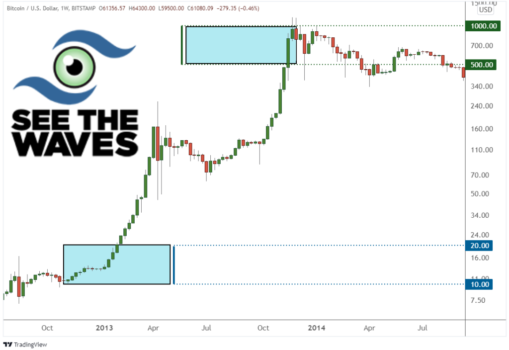
As an example, take a look at the chart above. I have drawn two boxes on the chart. The height of both boxes is the same. However, the span of prices covered is vastly different.
The box on the bottom has a price range of $10 to $20.
The box at the top has a price range of $500 to $1000.
Both boxes represent a 100% increase and that is why both boxes are the same height on a log scale.
On the other hand, an arithmetic chart (also called a “linear” chart or “regular” chart) sequentially steps through pricing one dollar at a time. Each major axis has the same point spread.
The biggest difference between log and arithmetic scale
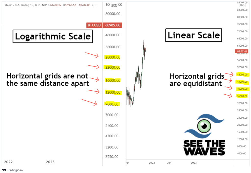
As you can imagine, the biggest difference between a log price chart with its brother the arithmetic chart is the distance covered.
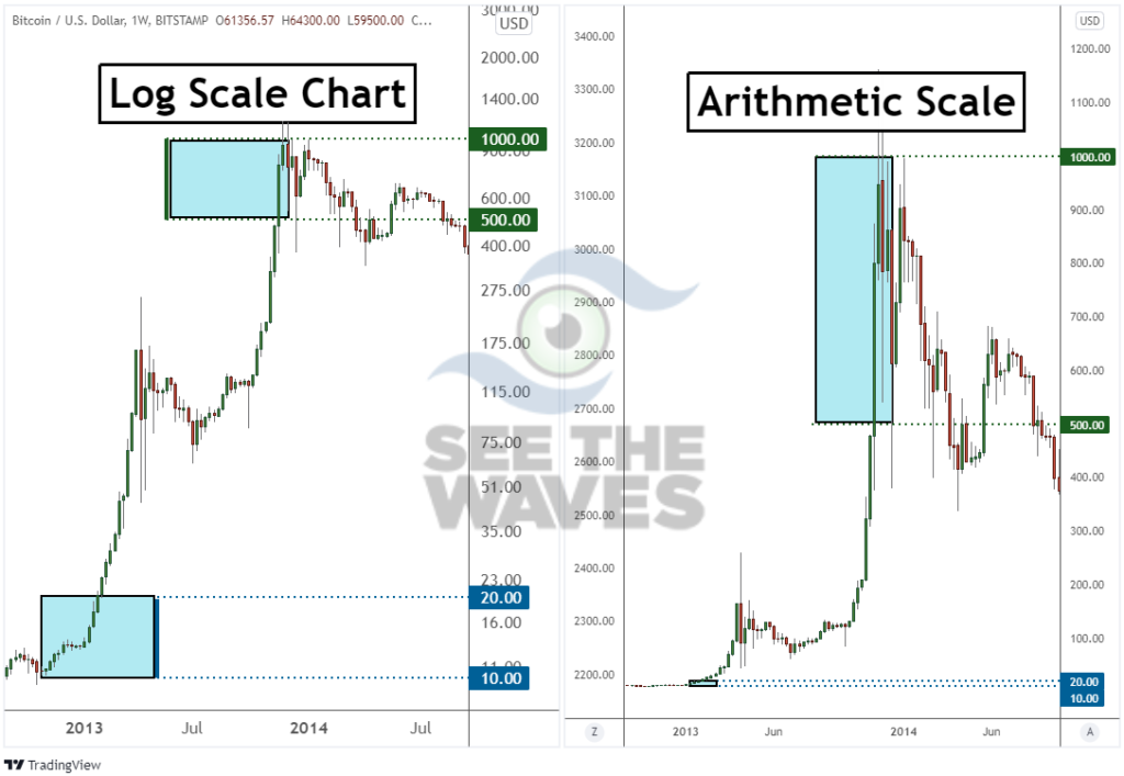
On the left above we have the same log scale chart we discussed earlier. Then, on the right, is the same chart but on an arithmetic scale.
The boxes are on the left are the same percentage difference which means at the higher number, you need more numbers to shove in the box. Each main gridline is not equidistant in price as it goes from 23 to 35 to 51 to 75 to 115 and onward.
For the arithmetic scale on the right, each main gridline is spaced out equidistantly in points. Notice how the price scale on the right increases from 100 to 200 to 300 to 400 and onward.
Why would you use a logarithmic scale?
There are two main reason’s you’ll want to utilize a logarithmic scaled chart when analyzing the market. First, if the market is volatile, then you will see huge market swings in a relatively short period of time. Those wild swings can be difficult to analyze on a linear chart.
For example, if bitcoin were to begin correcting another 5,000 points in a short period of time, people would look at that and talk about how volatile the market is. The crypto market is volatile, but a 5,000 point move today in bitcoin that is trading near $60,000 is not the same impact as when it was trading near $10,000 per coin.
A log scale price chart will smooth out those volatile readings to help place them on an “apples to apples” comparison.
The second reason to use a log chart is when you are analyzing a long historical period. For example, if you were to analyze the 10-year price chart for Facebook stock, the price increase has been so dramatic that it only makes sense to look at it on a log scale.
The logarithmic chart standardizes the size of the moves over large price movements and large time horizons so you can easily compare advances and corrections.
When is arithmetic scale useful?
There are times when a linear, or regular chart is useful to use. The first instance would be for day traders. Day traders are reviewing shorter chart time frames and therefore are assessing only the recent trends over the past few days. As a result, the arithmetic scale works fine as the price change won’t be as dramatic.
Additionally, the arithmetic scale is useful when analyzing forex charts. Since trade flows are still exchanged in fiat currencies the relative value of those currencies doesn’t change dramatically from year to year.
As an example, EURUSD is the largest traded currency pair. So far in 2021, the exchange rate has fallen about 7% (which we forecasted on January 6, 2021 in a live webinar). Seven percent in 10 months for FX is a nice trend. FX moves are smaller, so you can use a linear chart with it.
Which price scale is better for crypto?
Logarithmic scale charts are better for analyzing crypto trends. Crypto markets are notorious for monster trends and volatile markets.
Therefore, analyzing the log charts makes for a cleaner analysis most of the time.
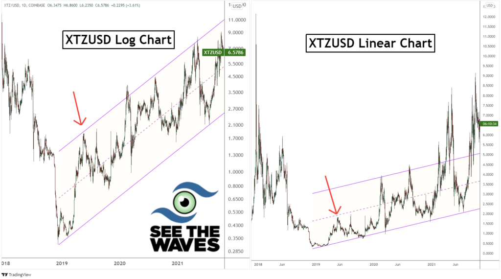
Take a look at Tezos (XTZ) above. On the left, we have a log chart and prices have conformed nicely within this parallel price channel. However, when the scale is changed to linear (right half), the parallel channel has a much different look to it.
I’ve also added a red arrow to help draw comparisons. The red arrow illustrates the same peak on both charts.
Within the crypto market, chart analysis has generally been cleaner when looking at the price history with a log chart.
How to determine the scale of your charts
It is extremely easy to determine what scale your current charting package is using. First, pull up a multi-year chart on an asset like bitcoin which has increased tremendously over the past couple of years.
Second, inspect the price scale on the right side. If the price scale is moving higher at equidistant prices, then you have a linear chart. If the price scale is moving higher in weird and non-rounded numbers, then your chart is a log scale.
Changing the scale on the TradingView charts
TradingView is one of the most popular charting packages out there. Personally, I have used their charts for several years.
Changing the scale is very easy on the TradingView charts.
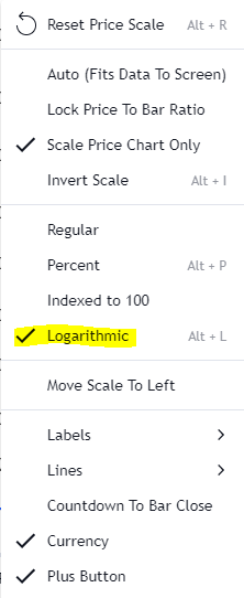
First, right-click anywhere on the scale you want to change and a menu will appear (shown above).
Second, select the type of scale you wish to change to. If you want to change to log charts, then select “Logarithmic”. If you want to change back to linear charts, then select “Regular”.
Once you have made the selection, the chart scale will automatically change and you are set!
Learn to read the price charts to identify higher probability trading opportunities. At See The Waves, we can teach you regardless of your experience level, how to read the charts to spot trends.